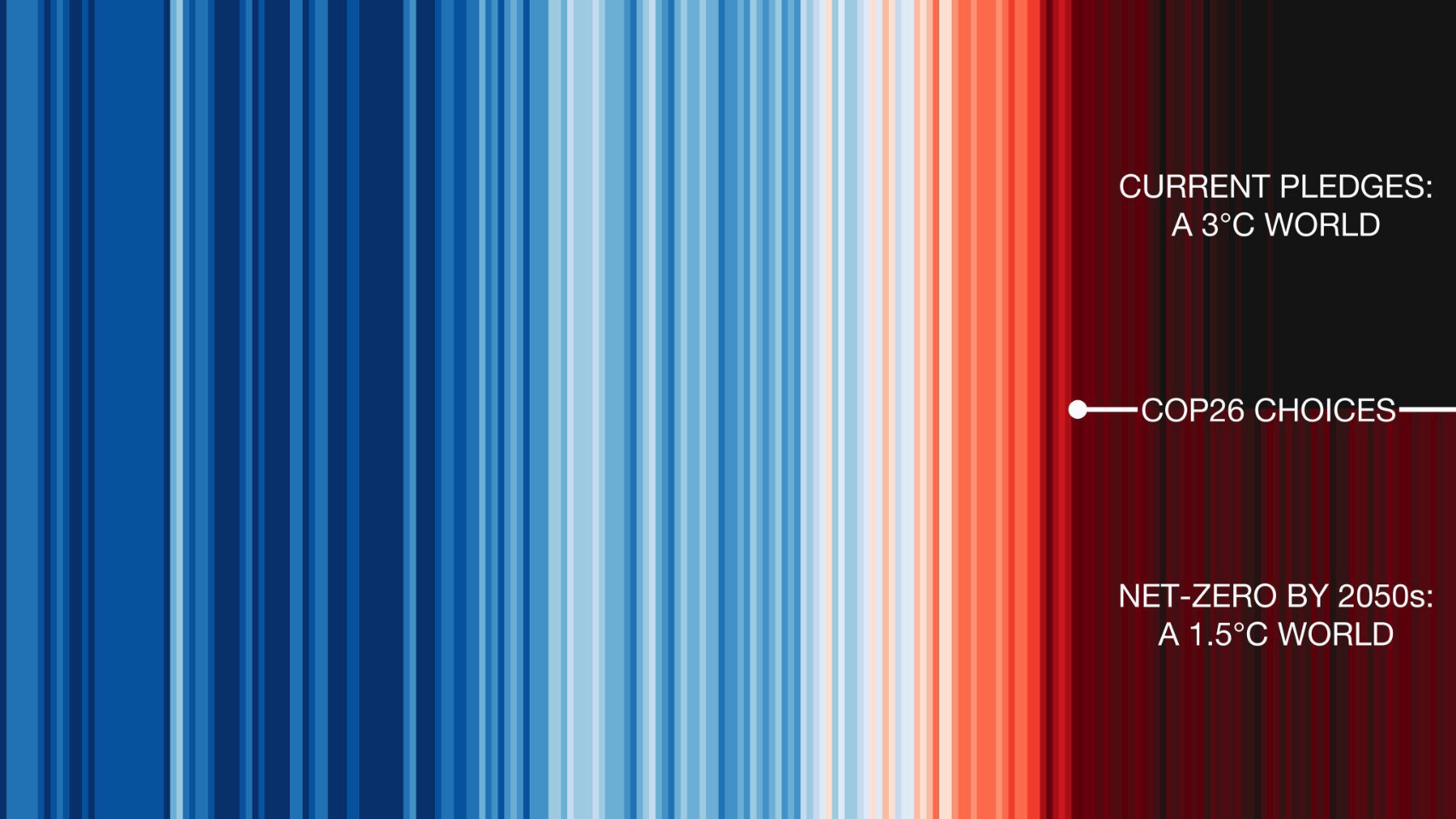
Graphic showing Hawkins' "climate stripes". A graph of the global temperature without axes, where the temperature over the last 140 years is only indicated by vertical coloured stripes. The colours go from blue for cold in the first half of the figure to bright red for the highest observed temperatures, as well as to dark red for future temperatures if we keep our promise to limit warming to 1.5°C and to black for future temperatures if we only implement the pledges currently made. The latter will mean about 3°C of warming.
https://fediscience.org/system/media_attachments/files/000/238/561/original/be3b9f0aa53b79dc.jpeg